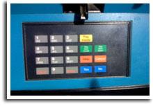
 Considering the prevalence of credit and debit cards in everyday commerce, you would think that the someone has already figured out the ideal layout for all the various keys needed to process a transaction. I see some version of this keypad at ATM machines, supermarkets, retail stores, wholesale supply stores, gas stations, etc. But, none of them are exactly like this one. Surprisingly, the gas station preserved the layout of the basic 0–9 keys for punching in PIN numbers and ZIP codes. Whew! However, they managed to violate every other convention.
Rule No. 1—Group Related Items. So, this gas station has three buttons for payment types: Pay Inside, Pay Here Credit and Pay Here Debit. But the pay inside button was yellow, and the other payment buttons were green. Additionally, if you wanted to pay inside, wouldn’t you go to the attendant and pay with your cash or card first? Who’s going to go to the pump, press the pay inside button and then head to the attendant?
Rule No. 2—Follow Standard Color Conventions. Green means go; red means stop. Why didn’t the designer follow this universal convention? Here, the gas station has two green buttons and two red buttons. The green buttons are for payment and the red buttons are for help and cancel. Because color has a different meaning at this gas station, all users must spend a few seconds reading all the buttons to find the one they are looking for. All these seconds add up.
Rules No. 3—Simplify, Simplify, Simplify. The designer should have made Yes and Enter the same button and coded it green. Cancel, no and clear should have been integrated into one button and have been coded red. Get rid of the Pay Inside button. Change the color of the Help button to Yellow. Change the Pay Here Credit and Pay Here Debit buttons to blue. Also, simplify the text to just Credit and Debit. I think most people will figure out what that means and having Credit and Debit appear larger will make it easier to read.
Leave a Reply